
 Post Punk Graphics
The Displaced Present, Perfectly Placed
published in Stuffing No.3, Melbourne, 1990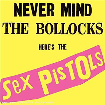
Punk Design Sense
The Punk Explosion As Revolution
Think revolution. Think punk. Think graphic design. That's where we're going to start. London, toward the end of 1976. Punk style had by this stage clearly become defined at the level of street fashion - enough for Malcom McClaren and Vivienne Westwood's clothing boutique Seditionaires (established since 1975 under the name SEX) to both feed from it and into it, making it easy (or simplistic) to fix them as a point of originating style. Perhaps they are seminal figures in punk style, but the style was not solely `their's' : it was half-ripped-off from the street scene (markets, pubs, art schools) and half-ripped-up from pages of design history (teddyboys, S&M, pop art). Origins and originality were obviously not the point. The point was in the rip.
Earlier in 1976, McClaren contacted Jamie Reid to provide some artwork for a new band McClaren had started managing as an adjunct to his publicity work for Seditionaires. McClaren and Reid met. They thought revolution - particularly the Situationists. They thought punk - specifically Sex Pistols. And they thought graphic design - all the Sex Pistols original concert pamphlets, tour posters, record covers, record advertisements, associated T-shirts, stickers and badges. As Sex Pistols' image was created, McClaren and Reid (working as management for The Sex Pistols under the name Glitterbest) blurred each other as points of originating style, as both had their aesthetic adrenalin running high on collage : John Heartfield political photomontages, cut-up manifesto-phrases, mass media imagery manipulation.
Effect : McClaren's tactics, Westwood's fabrics and Reid's graphics thrived on brut bricollage. This same aesthetic could be discerned in all their work, so much so that they formed a triumvirate for a clearly visualized punk design sense that would both darken and brighten the vision of many British designers in various fields to come.
Toward the end of 1976. The time is important : the fagging-out of glam crossing with the pumping-up of disco. It's the awkward calm before the punk explosion - a detonation of shards, slivers and fragments of images picked up and collected by punk subculture. It's not as much an era as an event; or at least a tightly converged sequence of rapid events that starts in December with Sex Pistols and their fans (the Bromley Contingent) being interviewed by Bill Grundy on prime-time Brit TV, dressed outrageously and talking foul-mouthed; to the `furour' the tabloids fanned over the Christmas period; to the cancellation of many punk concerts throughout the greater London region; to the growing reception of Sex Pistols' first two singles "Anarchy In The UK" (late 1976) and "God Save The Queen" (early 1977 : year of Britain's glorious Jubilee Year). There are many other details and incidents, of course, but they're all so compacted; so fused under pressure that the term `punk explosion' is not ironic but simply appropriate. Short-lived, frenetic, chaotic, the stage set for this event is truly revolutionary.
But - revolution not in the sense of `change' (though it can be argued that without punk happening at this time, much of what eventuated in music and youth culture and subcultures certainly would not have developed as it did) but in the sense of `unchange' : returning to something. Revolting and revolving toward a sensibility deemed gone, lost, missed. The punk explosion is at least revolutionary in these terms, because in many fields of cultural communication and social interaction punk sensibilities, attitudes and perspectives were irritated by the present enough to want to escape it, to attempt various strategies of returning to a past, of going backwards, of regressing and regurgitating; of refuting the present in the name of the past. Remember the call sign of the times : "No Future!" Most importantly, it was the means of returning the past that shaped the revolutionary spirit endemic to punk. The means of course was violent fragmentation, vicious juxtaposition and vilifying appropriation : grab it, steal it, cut it out, cut it up. Westwood, McClaren and Reid all made up their present from shattered fragments of the past mixed up and stuck together. The safety-pin thus became a succinct symbol for all the socio-cultural ramifications of such a modus operandi - safe yet dangerous; stuck together but hanging apart; repaired and impaired.
The Punk Legacy Of Negativity
Come 1978 and punk shrivelled up into a unified style - `style' being the enemy of punk's heterogeneous practice, the equalizer of its violent means. Even the name punk was being erased to escape stylistic constrictions : new wave, post-punk, new music, modern music, etc. Reid's `ransom note' lettering cut-up was labelled and categorized to the extent that Letraset easily could have released a `punk' typeface. (They didn't - but Apple Macintosh a few years later came up with their Californian typeface by ripping-off said punk style.) McClaren started exploiting his own exploitation tactics to refract the power beams of the exploitation industry in which he had become ensconced (attempting to perpetrate The Great Rock'n'Roll Swindle), while Westwood's new boutique World's End (with its large clock out front with its hands eternally spinning backwards) contemplated style beyond a new industrial revolution. (Together they refired their pistols through Bow Wow Wow's revolutionary `wild nobility' with a lesser effect, having reduced their tactics to pure style by creating the group's `pirate' look.)
So - the bonfires of the punk explosion died down. But much grew in the smouldering ashes. And that's where this article comes in : one thing that grew out of punk was post-punk design. It's far less ponderous and academic than it sounds. After punk had finished its first phase of existence (ie. once all the original bands had either [a] broken up, or [b] survived to release their 2nd album) there were many ways in which punk aesthetics, sensibilities and perspectives were picked up by a wide variety of musicians, performers, critics, entrepreneurs, stylists and designers, and reinterpreted and redeveloped to produce work which bore little surface resemblance to original punk design sense. They all did so by taking the conceptual/political approach to formulation, construction and presentation (a la McClaren, Westwood and Reid's brut bricollage, which had become typical of punk design sense) and applying it to different forms and materials under different conditions. This article will attempt to trace some of the main ways in which such reinterpretations and redevelopments of punk design sense shaped post-punk graphic design - and specifically, the graphic work done for record covers from around 1978 to around 1988. As we shall discover, the different trends which eventuate throughout post-punk graphic design are largely the result of different interpretations of the aforementioned `conceptual/political' approaches to design.
So we return briefly to London, toward the end of 1976. While Reid's work was often self-consciously amateurish (as opposed to his sometimes considered starkness) it nonetheless contained the seeds - in retrospect - for most of the major graphic trends that eventuated over the next decade. Let's take the logo he did for Sex Pistols. It is a logo only by defaulted contextualization - meaning, it was not designed with any relation to the graphic parameters that conventionally govern the logic of logo production and function, but ended up becoming a logo simply because it was used as one. It is in effect an anti-logo:
-

Type
 It is made up bluntly from letters cut out from newspapers so none of the letters match in terms of typeface.
Grid
The letters' spatial relation to each other negates any sense of a grid or plane within which the letters rest.Shape
The overall shape of the name similarly negates any deliberated sense of dynamic positioning.
Typical of whatever revolutionary fervour fueled such a design exercise, the Sex Pistols' anti-logo was as grossly negative as was possible. Before too long, though, it had become a powerful visual indicator of the negativity Sex Pistols were proclaiming both lyrically and musically. Reid was well aware of this, and constructed a continuing visual identity for Sex Pistols by further exercising and developing the conceptual/political features inherent in the logo, thus establishing a clear visual identity for the group.
But how was this reinterpreted and redeveloped by post-punk graphic design once such a method had become primarily identified as `style', devoid of its conceptual/political momentum? Consider the following in respective relation to the above points while viewing an analogous reconstruction of the original Sex Pistols logo:
-

Type
Typeface need not be restricted to available catalogues of the time; they could also be taken from `out-of-date' catalogues or other similarly neglected, under-used or unknown sources, so much so that the act of borrowing typeface (from the past) overrides the convention of employing typeface (in the present).Grid
Conforming features of typefaces and their internal grid logic could be unsettled and made disruptive, so that either a selection of typefaces could be jumbled for the purpose of them working against one another, or distinguishing traits of familiar typefaces could be made unfamiliar.Shape
Principles of dynamics, harmony and presence within grids, planes and frames could be totally redefined and repositioned, not simply by altering said grids, etc., but by reconceptualizing what grids, etc. might or could be, thereby constituting a new sense of shape.
Now, there is nothing inherently radical, innovative or revolutionary about the above points - considering that they form the basis of modernist design aspirations for this century. However, such points are utilized primarily for their negative effect in most post-punk graphic design. For example, while modern European post-WWII design revolutionized much thinking about graphic design along similar lines (to define new, modern and progressive senses of harmony and logic for visual interpretation) the effects of post-punk graphic design performs similar functions primarily in order to be willfully perverse and playfully self-destructive. As such, the desire behind much post-punk graphic design is to explore illegibility, illegitimacy and inappropriateness. These are the driving forces born from the punk explosion's smouldering revolutionary ashes; forces which - as I hope to indicate - mark the work of the post-punk milieu as the most important phase of graphic design since the importation and immigration of European post-WWII graphic design.
The Modernist Roots Of Punk And Post-Punk
In many ways, just as the decade from the mid-10s to the mid-20s contained the seeds for many of the forceful projections of 20th Century modernism in art and design, that same decade worked as a melting pot of inspiration and influence for punk and post-punk design. This is a harsh generalization, but all the punk and post-punk art and design students were superficially attracted to the `general' revolutionary feel of this period which encompassed WWI and The Russian Revolution, which in turn spiked many artistic developments that punk and post-punk aped and echoed : Dada's social anarchy; Futurism's implosive politicization; the dynamic abstraction of Supremativism and Constructivism ; the functional harmony of De Stijl; and the Bauhaus' centralization of all of the above. Furthermore, the resultant differences in post-punk design can largely be attributed to whichever art movement a designer would be more attracted to, as there were many conflicts between and within the aforementioned movements. In this sense, the Bauhaus' own melting pot of the practical principles and applications of Van Doesburg, Mondrian, El Lissitsky, Kandinsky and Malevich (which govern the `reconstructed' Sex Pistols logo 2) - while being viewed as a culmination of many of the major artistic impulses of this revolutionary period - could also be viewed as being diametrically opposed to the seminal irrational `anti-art' gesticulations of dada - particularly the drawings of Picabia, the graphics of Hausmann, the collages of Huelsenbeck, Hoch and Baader, and the combines of Schwitters (which influence the original Sex Pistols logo 1).
Both groupings can be formally, stylistically and graphically linked - yet conceptually and politically there is much that separates them. The chaos instigated by punk design sense and the multiplicity of post-punk graphic design can be traced to this period thus : post-punk graphic design reinterpreted and redeveloped punk design sense by going back to this historical period and configuring new tangents of influence from within the differing ideological developments of that tumultuous decade at the start of the century.
The Punk Record As Object
But finally - before we get into carving up the post punk domain into all sorts of territories - a few qualifications must be made for this article's specialization in record cover design. One must remember that whatever were the complex reasons that caused, determined and affected the punk explosion, the resulting `explosion' was expressed through music : the bands, the concerts, the magazines and fanzines, the fans and their dress, the records, the posters, the record covers. More than any other artifacts, the record covers were the prime means for spreading an image or set of images for the whole scene of which the music was an integral part. One must also realize that due to -
(a) Sex Pistols being ceremoniously `sacked' by both EMI and A&M within 2 months (!) causing their releases on those labels to become instantly rare;
(b) the first wave of independent record companies like Rough Trade, Stiff, Step Forward, Factory, Fast, etc. returning to the 7" single in small runs; and
(c) the preciousness with which the English rock press (NME, Melody Maker, Sounds, Zig Zag, etc.) treated all the small-run single releases throughout 1977 -
- the 7" single became re-invented as an immediately-collectible commodity. Much fuss was thus made over `picture-sleeves' and `limited-editions' which soon gave way to 12" singles and `collectors' releases. The graphics on all these covers were equally trumped-up, but in terms of design-work it meant that the designers were free to experiment and come up with novel, unusual and confounding ways in which to represent or create an identity for a band. This went in line with the exclusivity/originality/elitist notions affected by punk subculture that both the English rock press and the major record companies (most of whom had by 1977 scrambled to sign any punk band while the `fad' was hot) were attracted to. Most importantly, it was in such a highly visual and openly creative climate that post-punk graphic design sensibilities were being nurtured.
Quite clearly, advertising agencies - and to a lesser degree, the art departments of major record companies - had very little to do with all the creative energy going on in this realm (as any brief survey of the covers from the period will demonstrate). Also, punk graphic design during this early period (from 1977 through to the end of 1979) made little if no impact on magazine design, save for Zandra Rhodes fashion spreads in glossy clothes rags (punk-as-avant-garde) or Generation X pin-ups in girls' teen mags (punk-as-cute-rebellion). Of course, by 1980, `new wave' was everywhere - but that's another viral story, yet even `new wave' as dispensed by ad agencies and art directors in the early 80s was twee, tacky and tasteful when compared to the seminal figures we shall now discuss.
The Territories Of Post-Punk
The `territories' I have carved the post-punk graphic design milieu into will be presented, defined and qualified as follows :
-

Retro Design 1
Kitsch, Corn & Camp
Devo Inc., C. More Tone, Anya Phillips, Mike Ross, Ian McIntosh, B52s/Island Art, Ray Lowry, Keith Breeden, The Compact Organization, Bruno Tilley, The Unknown Designer, Laura LiPuma -

Retro Design 2
pre-Postmodernism
Barney Bubbles, Geoff Halpin, Rockin' Russian, Neville Brody, Graham Smith -

Retro Design 3
Pseudo Classicism
Graham Smith, Peter Saville Associates, ABC, New Collectivism Studio, Underground, The Leisure Process, Assorted Images -

Fine Design 1
Aesthetic Grain
Bloomfield/Travis, Laura rae Chamberlain, Brian Eno, Russell Mills, Town & Country Planning, Keith Breeden -

Fine Design 2
Micro Detail
Peter Saville Associates, 23 Envelope, Hennebert, Soviet France -

Hyper Design 1
Neo Type
Assorted Images, Neville Brody -

Hyper Design 2
Street Face
Loaded, Da Gamma, The Leisure Process, Federation, The Sanitary Steam Laundry Company -

Hyper Design 3
Digital Text
Peter Saville Associates, Gary Mouat/AI, Assorted Images, The Designers Republic, Vivid
These categories and sub-divisions will be defined in their appropriate sections throughout the article, with reference to presented covers. Unfortunately, there is no simple way of presenting them in any order, because they all concur and cross-fertilize each other. Unlike most accounts of art movements and trends, the myriad of categories of post-punk graphic design are aligned with the frenzied networking of English youth and music subcultures which proliferated from around 1978 onwards. The `triple play' effect of music/scene/image as highlighted in the Sex Pistols' heyday becomes a major model for all the categories and sub-divisions of post-punk graphic design : a hip scene starts up aligning itself with a certain music style which attracts certain people who dress in a certain way, all of which is fused into a visual imagery employed for the relevant record covers, designed by someone with a certain fix on a particular period of art history. Where the beat goes on is where the image comes in.
Retro Design
Outline
Retro design is a term I'll use to cover all artistic and design-oriented impulses to re-use something from the past with as strong an emphasis as possible on not altering or transforming the original. As such, it covers everything from second-hand to second degree. The concern in retro design, though, is - ironically - not to be authentic, because then no-one would know that you actually are re-using something. In post-punk graphic design the tactic is as clear as it is perverse : the desire is not to `return to the past' but more precisely to return the past; to cut it out and paste it up in the present. Thus, a designer's reasons to use something `old' (say, anything from 30s art movements to 40s jazz record covers to 50s National Geographic spreads to 60s stocking advertisements) generally would be to :
(a) confound the viewer so that he thinks he is looking at some other kind of design object - least of all a contemporary record cover;
(b) make a point about how extreme are the means being employed to escape current state-of-the-art 70s design options (airbrush, hi-tech, pseudo-nostalgia, naturalism, etc.); and
(c) convey a smarmy sense of hipper-than-thou style through displaying the `real effect' of the material being appropriated.
Ultimately, there is something almost antagonistic about such retro measures, because - true to punk's negativity - much post-punk record cover designs almost negate their intended communicative function through their attempts to make points such as those above. Most interesting, these methods of appropriation were totally defined by 1978 (years before issues of appropriation were handled clinically by theoreticians tiptoeing in the realm of fine and contemporary art, specifically in New York : more on this shortly).
Kitsch Camp & Corn


In London, they called it revolution. In Akron, Ohio, they called it `de-evolution'. This was Devo's theory of society - that, ever since Man evolved from the ape, he has been continually devolving back into a sub-primate species. Devo cunningly and satirically pointed to many aspects of contemporary everyday life in America to `prove' their theory, referring to middle-class America as a race of `mutants'. Their evidence was presented in the form of images from America's more positivist past : from the communal spirit and patriotic fever of the atomic 40s to the affluence and higher culturing of the post-atomic 50s. The cover to their first album Are We Not Men? (1978) features an illustration of the face of what in the late 40s would have been perceived as a normal man, but now looks like an incredibly unrealistic depiction of what could only be a human mutant. In a mode of high irony, the album's title sardonically begs its question.
Devo's found-images were torn from ads that appeared in magazines like National Geographic, Life, Readers' Digest, Scientific American, and many other forward yet fairly retrograde and reactionary magazines that fostered the image of healthy, normal, ideal America during and just after WWII. Thus, Devo's artwork for their records (designed by Devo Inc.) used this kind of imagery to propagate their theory of de-evolution in a variety of manifestations : the futuristic/scientific outlook of Duty Now For The Future (1979); the inspirational democratic ethics of Freedom Of Choice (1980); the postwar classicism of Las Vegas of New Traditionalists (1981); and the straight-out wacky and zany corn of Oh No! It's Devo! (1982). Through their mutant approach, Devo personified retro design. Next to Jamie Reid, they were the only designers who had an articulated theory on why they were appropriating their selected images.


Interestingly, Devo were signed to the Stiff label in England which by 1977 was the most successful independent record company in England (before the term `independent' became such a catchword in the music biz). Stiff records made it's reputation by savagely sending up all the promotional tactics of the majors, making them parallel in a way to McClaren and his Situationist-inspired ideas of marketing, except Stiff were more humorous and in the end more productive. Devo's satirical tactics fitted in well with Stiff's acerbic outlook, and in terms of design the work of Devo Inc. perfectly complemented the retro image that Stiff were fostering in a very tongue-in-cheek fashion. Without trying to pin medals of origins on anyone, it appears that after Devo's total outlook - exemplified through their theories, film clips, live concerts, records, record covers and record promotion - burst onto the English scene in early 1978 to critical acclaim, it pushed Stiff's art department to further pursue all manner of retro imagery along Devo's lines of appropriation.
This is clearly evident in the specific imagery attached to certain Stiff groups : the bright and bold beat look of Dirty Looks and Any Trouble; the original ska-design tone of Desmond Dekker and The Equators; the glitzy chrome'n'classic look of early Madness and Jona Lewie; the stark modern advertising look of later Madness; etc. The covers for these bands definitely reflected the multifarious 60s revivals that were peaking throughout 1978 : ska, mod, beat, and so on. In line with this, though, the record cover designs primarily pushed kitsch (deliberately playing with postwar design's upwardly mobile `classical' look); camp (flaunting the cheapness and crassness of slick and stylish design from the 50s and 60s); or corn (simply making fun out of looking out-of-date). The point is that all these modes of artifice and theatricality were employed by `reviving' record cover design and advertisement layouts from the 50s and 60s. This tongue-in-cheek revivalism was an important part of Stiff's overall visual image. (Designers here include the official head of the Stiff art department, Simon Reynolds plus freelancers like Al McDowell [aka Rockin' Russian - more on him later] and Chris Moreton [aka C. More Tone] - the latter who went on to design the outstanding logo for Go-Feet and all The Beat covers.)


While Devo's work stands out from the revivalists, there are a few covers which handled the tactic of revivalism so well they deserve mention (note: few of the Stiff revivalist covers stand out on their own as interesting designs and rather contribute to the label's overall identity). Anya Phillip's design for James White & The Blacks' Off White (1978) is very authentic in its restrained design of 50s jazz record covers, while Little Nell's The Musical World Of Little Nell (1978, uncredited, but on the A&M label could likely be the work of Mike Ross) is so perfectly camp with its cheesecake it too has a certain feel for authentic 50s tacky pin-up magazines. A similar feel is displayed in a set of covers designed by Ian McIntosh & Sputu for the new look Revillos throughout 1979 and 1980 which freely draw upon cartoons, The Thunderbirds and far-out Op and Pop 60s fashion trends. Similar to The Revillos but with a much more introverted almost serious commitment to style, The B52s were another band so obsessed with their sense of style that one could say that the band themselves were mainly responsible for the visual appearance of their covers (something that also applies to revivalist groups like The Beat and their Go-Feet label, and The Specials and their Two-Tone label). The B52s presented the most streamlined retro statement in the covers to their first two albums The B52s (1979) and Wild Planet (1980) : kitsch, camp & corn all so tightly compacted it's difficult to divine such modes within the image presented. (Later covers for The B52s are handled by Island Art and skillfully extend The B52s' unique sense of retro style.)
Once the revivalist schtick had worn thin with the English music press by 1980, the kitsch, camp & corn tactics were either (a) inverted for further political commentary; (b) reinterpreted under new terms of bricollage; or (c) subsumed by mainstream graphic design.


A good example of stylistic inversion is the work cartoonist Ray Lowry did for The Clash. His cover for their album London Calling (1979) is a careful pastiche of Elvis Presley's 1956 EP Blue Suede Shoes. Far from being a stylish joke or a yearning for good ole rock'n'roll, the effect of Lowry's work is contained in the difference it holds to its original : the latter features Elvis in youthful prime, head angled up with eyes closed tight, strumming that acoustic guitar to rockabilly heaven; the former features Paul Simonon in his youthful prime, legs ungainly spread apart and head bowed down as he smashes his bass guitar onto a floodlit stage in a spectacle of destruction. The point, it appears, is pretty plain. (Even more relevant though somewhat pedantic : the colours that 1977 punk singles had to be in were B&W photos with bright pink and lime green lettering; London Calling - The Clash's third album and their call for a return to the spirit and energy of punk - visually referred to and revived a more immediate yet equally lost era.) A similar ploy was used in Lowry's cover which employed the generic cover design to late 50s HMV 45s which featured young couples dancing and listening to `popular music'. Used for The Clash's London Calling 12" single (1979) it is simultaneously ironic, idyllic and nostalgic - especially as the couple on the front have records by Elvis, The Beatles, The Rolling Stones, Bob Dylan, The Clash and The Sex Pistols anachronistically spread out before them.
Another example of ambiguous appropriation (minus the distantiation of more refined art practices in similar veins) is in Keith Breeden's cover to ABC's Beauty Stab (1983) which carries a typical image of middle-class romanticism - a gaudy oil rendering of a matador stabbing a bull (complete with Breeden's mock-rendering of his own signature). ABC were as open about their fatal attraction to sheer superficial emotionalism and the intensities it could reach just as The Clash were with their alignment with the positive energy of wild youth despite its short-lived appeal. Perhaps the most ambiguous work here is that done for the Compact label, an independent English label which aimed at breaking into the mainstream pop market by playing up retro style with maximum kitsch, camp & corn. Their biggest success was Mari Wilson, whose cover designed by The Compact Organization for her biggest hit Just What I Always Wanted (1982) depicts in obsessive detail the perfect retro environment for the style-conscious consumer of the early 80s.


The reinterpretation of this kind of retro style and imagery under new terms of brut bricollage is a hard one to specify, as the nature and content of such an approach becomes so open-ended it too complexly bleeds into many differing modes of graphic design - many of which are not solely within the domain of post-punk graphic design. More American in tone than the English tendencies described above, a lot of work in this vein appeared on the covers to many ZE records - a label which was distributed in the UK through Island. The introduction of the ZE stable came to many in the UK via the compilation Mutant Disco (1980) designed by Bruno Tilley. (Perhaps Bruno Tilley - whose name is credited on many distinctive Island covers for U2, Linton Kwesi Johnson, Kid Creole & The Coconuts and others - is one of the figures behind the distinctive B52 covers on Island done by Island Art in the latter 80s). The best and most consistent examples, though, are to be found on the covers of Was Not Was who originally started out on ZE. The design credit on their records from 1986 onwards is The Unknown Designer who developed further the Mutant Disco style of mutant/retro/cut-up in a highly distinctive manner. One of the first covers in this series was for Was Not Was' Robot Girl (1986) which was a cunning rework of Malcom Garrett's (with Linder) first cover for Buzzcocks, Orgasm Addict : both covers feature neo-dada collages of naked torsos and machine parts. Other Unknown Designer covers include Spy In The House Of Love (1987) and Out Come The Freaks (1988).


But mostly, kitsch camp & corn stylizations after 1980 belong in the mainstream. See the covers to Madonna, Bananarama, and many other 80s white pop figures who have been marketed under `pseudo-ironic' terms - meaning, they attempt to distance themselves from the artificiality of pop whilst bent on reaping its benefits (sometimes it works; usually it doesn't). Toward the end of the 80s the situation remains the same : those records with the better retro covers in this artificial pop vein are not necessarily commercially popular. Some examples : Nile Rogers' B-Movie Matinee (1985, design uncredited) with its beautiful recreation of `googy' interior design style for 3-D glasses, and Madhouse's 8 (1987, designed by Laura LiPuma) which looks like a page torn from Dianne Keaton's definitive coffee-table compilation of the American retro angle, Still Life. Both these covers pick up on the retro sensibilities Californian design had developed in the mid-80s, which in turn picked up on Devo's original mutant approach, crossed it with the glitz of pop, beat and ska revivalists, and glossed it over for mainstream presentation. In the late 70s Californian design was still high on the fumes from airbrushes, so it was no wonder that by the mid-80s Devo had jettisoned themselves out of the retro void and into the digital 80s - as far away as possible from the quaint and cute products of what had become innocuously termed "new wave design" - showing off your punk outfit without wearing it.


Pre-Postmodernism
We now come to one of the most influential and inspirational record covers of the whole post-punk milieu : The Damned's Music For Pleasure (1977). It's designed by Barney Bubbles, who also happens to be one of the most enigmatic figures in punk and post-punk graphic design. Bubbles worked almost exclusively for Stiff records, and as Stiff specialized in quirky individual recording artists (Ian Dury, Elvis Costello, Wreckless Eric, Madness, The Damned, Lena Lovich, et al), Barney Bubbles' approach to graphic design fitted in perfectly. (Quirky as he was, the thing that makes his work very difficult to discuss is that he refused to sign anything - ever - so `his works' which I will discuss are credited as such partly from random magazine sources over the years and partly from my attempt to divine his particular approach. His suicide in the early 80s unfortunately didn't surface much more information as to his actual credits and credentials, though this will hopefully be rectified one day.)
Music For Pleasure - if you look at it carefully - carries both the band's name plus caricatures of its four members. Can you pick them out? Don't worry if you can't : the cover is a virtual dare for you to do so. The most fascinating thing about the cover, though, is the wild mix of artistic influences : eastern block (Malevich's supremativism, Klee's eclectic Bauhaus style, El Lissitsky's constructivism, Kandinsky's improvizations, Russian revolutionary posters, etc.) meets western blockhead (acid, day-glo, 50s product logos, Warner Bros. cartoons, etc.). Instead of being paraded as an intellectual exercise, the wild cross-referencing and mutation is put to the service of the self-destructive visual gags of the cover (the illegible lettering and the hidden facial caricatures). In other words, there is a point to this cover - but there is a wish imbedded in its design that you might actually miss the point.
Bubbles is the most extreme exponent of such a strategy in post-punk design, and consequently has been very influential on many of his contemporaries who have since become well known. This strategy could be termed `postmodern' superficially. I've bracketed him pre-postmodern for two main reasons.
Firstly, his work predates the first major wave of so-called postmodern art in New York (Komar & Melamid, Kruger, Sherman, Longo, Salle, Mullican, Goldstein, et al) around 1981. However in reference to the critical methods employed to position the early 80s New York postmodernists (appropriation, multiplicity, signification, simulation, schizophrenia, etc.) Bubbles' work - as graphic design instead of fine art - exercises such self-consciousness in a decidedly more relaxed and looser manner. For Bubbles there is no big deal to be made out of juxtaposing Kandinsky's non-objectivity with Warner Bros. `funky cubist' style from the 50s, (something the Russian expatriates Komar & Melamid might `cleverly' make something out of) because the value of their difference to one another is marked insignificant by their relation to one another in an ahistorical present. Or to put it simply : post-punk graphic design follows more closely the casual cultural operations of rock and pop music (trends, influences, hybrids, collusions, etc.) than the philosophical notions of craft, skill, expression, originality, etc. which fostered and filtered through the modernism of the first half of this century.
Secondly, Bubbles' work - due to its socio-cultural functioning outside of the domain of fine art appreciation and historical discourses - is fairly concrete in a modernist sense. His bricollage is made of fragments which are not collided and collapsed into each other either for pure stylistic effect or pristine theoretical play (archetypal postmodern approaches) but combined and contrasted so that the lateral connections between the fragments are evident. There is no `collapse of meaning' in the cover to Music For Pleasure. It clearly communicates its lateral references : The Damned as crazy cartoon characters high on speed zipping through an adrenalin-pumping hallucinogenic zone; the noise they make through destroying musical conventions - much the same as jazz did, which is what partially inspired Kandinsky's view of pictorial composition; the outright illegibility of the cover being typical of punk's desperate measures to escape qualification and classification; and the elusive but relevant connections between Russian revolutionary art with all its askew angling and the revolutionary aspects and desires of the punk explosion. I've detailed these references precisely; but at the time, most of this was just as obvious to the `art school trained' punk subculture, through Bubbles deft combining of such elements within the perverse framework of his visual communication.


More than any other post-punk graphic designer, Bubbles communicated all of the above with the most clarity, precision and invention. He designed the second version of the Stiff logo in 1977, but really came into his own with the 3rd Stiff logo he produced in 1978. This set the trend of para-illegibility for the next three logos (all which Bubbles may have designed, though I suspect not the last two : they're too easy to read). Bubbles also designed the logos for Radar records and F-Beat records. Other logos Bubbles designed were those for The Rumour, The Blockheads, Graham Parker and Wreckless Eric. But the best is the 3rd Stiff logo. Its origins can be traced to one of his smartest cover designs, Ian Dury & The Blockheads' Hit Me With Your Rhythm Stick (1978).


Firstly, the cover to this single is based not on the A-side but the flip-side There Ain't Half Been Some Clever Bastards. As far as conventional marketing techniques go, that's pretty perverse. The front cover shows a strange assemblage of geometric block polka-dot shapes threaded together with some pink string. Behind is a lime green square divided into seemingly random geometric shapes. Turn the cover, and those polka-dot shapes have been assembled into a weird constuctivist toy dog, with a diagram in the lower corner demonstrating how the shapes that made up the lime green square on the front cover can be repositioned to make up an origami-like dog figure. The point to all this? Only the possibility that you might miss it again. Now look again at that 3rd Stiff logo. It looks like it has largely been based on a similar play with the same shapes. Once again, for no discernible reason, except that Bubbles always seems to have played these obsessive introverted games with his own perception to come up with his finished design concept. That Stiff logo is then taken one step further on the label of Ian Dury & The Blockheads' Do It Yourself (1978) where the `s' and the `t' of the logo are made to appear like the handle of a paint brush which has smeared a large blue `S' across the record label. (Perhaps in an oblique way there's even a Duchamp influence on all this extreme visual punning.)


Finally, let's briefly flick through some of Bubbles' most distinctive covers. Typical of his own self-destructive identity, the cover he did for Do It Yourself was an absurdly extreme reaction against his own style : he used the plainest typeface possible and superimposed it on a range of the cheapest wallpaper deigns he could find (the album was available in 28 different designs - a deliberate deterrent to the `collecting' bug of the time!). This of course ties in with the `brush' motif on the label - a brush being needed to pasts up the wallpaper. The inner sleeve contains is a very obscurantist illustration that reinterprets the strange photo on the back over. When comparing the two images (the back cover photo and Bubbles' reinterpretation of it) you get an idea of how distorted his perception was. A similar obtuse playfullness is to be found on his cover to The Rumour's Emotional Traffic (1979) where the image of a traffic light is combined with his Rumour logo plus the red vinyl record enclosed which is glimpsed through a hole die-cut into the record cover. Another Ian Dury & The Blockheads' cover Spasticus Autisticus (1981) is one of Bubbles' many plays of human faces : the image is at once a breakfast plate with eggs, bacon and chips, as well as the head of an American Indian with headdress! The facial-distortions continue with the cover to Dirty Looks' Turn It Up (1981) where the faces are no more than geometric shapes assembled on hand prints. And last but not least is the cover to Elvis Costello & The Attraction's Almost Blue (1981). Echoing Ray Lowry's work for The Clash, it is taken almost directly from Frank Burrell's Midnight Blue album on the Blue Note label. Almost Blue was Elvis trying out country & western ballads, so Bubbles' cover makes a point about him attempting another style : the music is `almost' country blues (a second degree version of the real) so the cover is `almost' an original and `almost' the original.


Before too long, the Bubbles influence was discernible in many other designers' work. While many of them are fairly unimaginative copies, two covers stand out and are virtually equal to Bubbles' own : Squeeze's Cool For Cats (1979, designed by Geoff Halpin) and XTC's Drums And Wires (1979, designed by Jill Mumford). Both utilize the method Bubbles had appropriated from 40s and 50s product logo design : making a face out of the letters of the product's name. By virtue of this particular line of appropriation, one is reminded that a large part of 50s Americana design is the result of designers pastiching various trends in modern art - cubism, de stijl, abstraction, expressionism, fauvism, etc. - by solidifying and reconstructing their visual style into geometrical stylizations. Hence the clarity evident in these two examples : Cool For Cats verges on camp with its accent on kitsch colours and shapes (in line with the corny hipness of the album's title); Drums And Wires clashes a diverse set of modernist stylings while glancing sideways at similar tactics in graphic illustration from the same period (stylized, angular faces equalling angst-ridden dispositions, expressed with most effect by Ian Wright who did drawings for a variety of albums and rock newspapers).
This kind of post-Bubbles' boldness is perhaps best encapsulated in the work of Al McDowell under the moniker of Rockin' Russian. If you need proof that revolutionary art was influential on most art students studying design during this period, Rockin' Russian's name alone says it all : you could support the punk revolution by flicking through poster books at the public library during the day and checking out bands at night. It sounds awkward - ridiculous, even - but Russian revolutionary art in the late seventies was ... cool. (And it still is.) Rockin' Russian partially affected the look but also developed a strong style of his own by employing stark wood-cut outlines which gave a comic book effect to his imagery. Known originally for his distinctive T-shirt designs for NME and THE FACE (which come after even earlier work he did for McClaren & Westwood), he eventually moved into record cover designs after working in the Stiff art department - The Scars' Author! Author! (1981) being a good example of his recognized style.


He also did a lot of work for Siouxsie & The Banshees - the definitive post-glam artschool band who started out as Sex Pistols' fans. For the Banshees he developed more of an ornate Viennese style whilst still retaining some of his Russian revolutionary motifs, best demonstrated in the gold-printed cover for Siouxsie & The Banshee's Fireworks (1982). (This cover's mix of Eastern block styles - incorporating heavy industrial blocking, imperialist motifs and styling, and rural peasant embellishments - surfaces first in the covers David Claridge designed for the British/Indian group Monsoon in 1982, then Town & Country Planning's work for Depeche Mode over 1983 and 1984, and then again with some later Banshees covers designed by Crocodile in 1987, altogether forming a subgenre that combined rural/peasant/ethnic/folk iconography - earth, grain, muscle, etc. - and imperial/colonial stylistic traits - ornate borders, ersatz trappings, etc.)
Brief mention must here be made of a portion of Neville Brody's work which is directly influenced by the Russian revolutionary woodcut style mentioned above (although we shall cover Brody in detail in the Hyper Design section later). Brody worked with Rockin' Russian for a short period around 1980/81 where McDowell apparently introduced Brody to a range of revolutionary and propaganda poster designs from all over the European continent (best reflected in Brody's cover to Desmond Dekker's Black & Dekker LP). Typical of much that was happening at the time, Brody's covers to The Slits' Earth Beat and Defunkt's Razor's Edge (both 1981) waver between proletariat posters and pulp covers due to the theatrical angst and gaudy heroics of their pseudo-brushwork, making this branch of his work (mostly done for the Fetish label) highly ambiguous and highly stylish. His `painterly' technique here partially harks back to the radical stylistic formations being ideologically forged at the start of this century, and partially to American 40s design which ripped off the Bauhaus' conformation of modernism's wilder excursions. Confused as it all sounds and appears, these are the kind of wildly-flung effects which shoot out from post-punk design that consciously parodies individual periods of art history.


Perhaps more than either Bubbles, Mumford, Halpin, Rockin' Russian or Brody, some of the early work of Peter Saville is the most highly conscious in respect to the brutish pillaging of the whole history of art. Ironically, Saville displayed his brutishness with great finesse. I'm particularly addressing a set of covers he did for New Order and Ultravox (other portions of Saville's output will be discussed in more relevant sections). Next to Jamie Reid, Peter Saville is the most recognized `artist' born out of the heyday punk, perhaps because he was so vocal and direct about his artistic influences (accepting that Brody is renowned more as a designer). Just as Reid visually defined Sex Pistols, Saville provided the overall `industrial' image for the Manchester independent record label Factory Records (note: 1977 was the `industrial' year - from the arty pseudo-futurist noise of Throbbing Gristle to Bowie & Eno's arty collaborations in Berlin, grey was in).
Saville virtually operated like a New York postmodernist, because he wasn't simply content with unsettling historical artworks and jettisoning them into the present : his work was clearly involved in the delicate and sometimes delirious operations of quotation. He launched this tactic with New Order - the group newly-formed out of the remaining members of Joy Division after their lead singer Ian Curtis committed suicide in 1981. Taking his cue from the band's new name (a typically punk ambiguous reminder of the fascist New Order), Saville based his designs for the first three releases by New Order on Futurist posters and book jackets : Ceremony, Everything's Gone Green and Movement (all 1981). The point with these designs is that Saville changed only the slightest of details, consciously applying Jan Tschichold's views on type and placement, and unwittingly giving us a simple demonstration of Barthes principle of the `second degree'.


But let's sort a few things out here in order to contextualize this highly conscious operation typical of pre-postmodern tendencies in retro design : (a) in the late 70s, every punk art student worth their salt was instantly attracted to the anarchy of the Futurists, the Dadaists and the Surrealists; (b) those poster images Saville used were much reproduced in most books on Futurism; (c) punk didn't have a license to deal exclusively in Kaiser, Nazi and Axis imagery - check out American biker subculture throughout the 60s, the gatefold spread to Led Zeppelin II from 1969, most of the Teutonic-influenced hard rock and heavy metal of the 70s, or even Ron (ex-The Stooges) Ashton's band from around 1978 called New Order; and (d) in art and design courses over the past ten years, the Bauhaus school and Tschichold's `severity and brevity' have been popular with every post-punk graphic designer looking for ways of rejecting the obvious `style' punk had devolved into by 1978. My point is that Saville's tactic was as clear a sign of the times as it was clear in its execution and communication to its audience - most of whom had possibly flirted with an art course at some point in time. (Don't forget : America had suburban garages for fostering punk groups; England had art schools.)


This means - once again - that Saville's work which used known artistic works from the domain of fine art history was playing a fairly unintellectual game, contrary to how it might appear. Saville, though, developed this quotation further than others. The second New Order album Power Corruption & Lies (1981) simply reproduces a scintillating detail of a Fantin-Latour painting and credits its source : The National Gallery, London. To cue us in on the mode of reproduction employed, the right edge of the cover carries a colour check guide in the form of a printer's 4-colour registration code. Here Tschichold's theories of mechanical reproduction (designing for such processes) are collided with Benjamin's (the delusions involved in such processes) making this a pretty clever cover. Other covers that work along similar lines - some better than others - are Roxy Music's More Than This (1982) (a Rosetti painting) ; Ultravox's Hymn and Quartet (1983) (reworkings of Symbolist painting styles); and one with a smug title if ever there was one - New Order's Thieves Like Us (1984) (a di Chirico painting). Thus Saville's work is neither a cunning gesture toward quotation, nor an apolitical and bankrupt form of scavenging (to use the two sides drawn up in postmodern debates in the early 80s) but an application of Tschichold's modernist theories in a postmodernist era, so that the foregrounded presentation of `appropriated imagery' is simply the result of rarifying a process for constructing an image.


A designer with a much less formulated approach than Saville's is Graham Smith. He picked up on modernism obliquely : by dealing with African and Incan tribal imagery much like that which inspired European modernism at the start of this century. Two covers he did for Spandau Ballet represent this stylized recapitulation of a modernist fixation with primitivism - Chant No. 1 and Paint Me Down (both 1981) (with designs probably lifted directly from a Dover book on signets and motifs). The tribal fetishism was not as arty and arbitrary as it seems now, because at the time `club culture' (the English obsession with late night dancing at elitist clubs) was viewed along with most early 80s developing subcultures as a form of tribal interaction. It's a pretty tacky metaphor but one that was hip at the time. (By 1983, there was a Time cover story titled "The Tribes Of Britain" which featured an image of a mohawk punk.) Smith also did three covers for Blue Rondo A La Turk whose music was perfectly polyglottic (stylistic reverberations of jazz, blues, latin, disco, bebop and funk - in any one song) : Me And Mr. Sanchez, Klacto Vee Sedstein and The Heavens Are Crying (all 1981). The covers all use paintings by Chris Sullivan, leader of the band, and while perceived as very stylish at the time, they're ultimately very good examples of the new kitsch which developed out of some post-punk graphic design. Still, these are important signs of their times - taking something like Picasso's synthetic cubist Three Musicians and thinking (without a trace of irony) that it would make a good record cover. This era of early 80s British clubland was touted as being consciously visual, when in fact a lot of it was surprisingly `unconsciously literal' in its interpretation of image semantics and semiotics. (Other club culture record covers Smith did were for one of the more stylistically radical artistes, Hayzee Fantayzee.)


Pseudo-Classicism


The first two covers Smith did for Spandau Ballet announced the arrival of what has mostly been termed New Romanticism. It's another tacky term from the time, but whatever the case, Spandau Ballet where the prime new romantics and their covers To Cut A Long Story Short (1980) and Glow (1981) perfectly represent the pseudo-classicism with which the new romantics were afflicted. The new romantics and their `blitz' or `no name' culture formed a defiant reaction against punk's aggression and anti-style. Besides which, what could be more anti anti-style than a reaction in the opposite direction : a return to the sedimentary and the seminal - classicism. Spandau Ballet were yet another band who while rejecting punk carried on what had by then become a punk tradition : the flirtation with Nazi fascist imagery. This time round the accent was on Hitler's neo-classical aspirations for the Aryan race. Spandau Ballet acted out the part to the hilt (and the kilt, an article which they were responsible for bringing back into fashion after punk had cut it up for bondage pants).
ABC came onto the new romantic scene intent on redefining the term. They did so with style and panache, even if at times they were pretty heavy-handed with their reinterpretations of Roxy Music's reinterpretation of the rock'n'pop style manual. ABC's covers had an aura of authenticity about them, and it was apparent that the group's leader and key stylist, Martin Fry, was almost pedantic with the attention to `old Hollywood' type styling and placement, as many of their covers are co-credited to the band. More than any other new romantic group, ABC were so sincere about their cheesy romanticism and classicism that they were capable of coming off authentic through a suspension of disbelief - very Hollywood, to say the least, as perfectly cued by the meta-theatricality of the cover to their first album The Lexicon Of Love (1982). Their cover to All Of My Heart (1983) is a parody of the Deutsche Grammophon label, with the band dressed up like Bryan Ferry did at the time (Anthony Price suits out at the country house) and is a good indication of the band's desire - to be Roxy Music - and distance - acknowledging that classical music is presented with as much image marketing as `disposable' pop music.


Much later - yet still within the sub-division of pseudo-classicism is another record that took off the Deutsche Grammophon house style : Laibach's Baptism (1987). It is designed by the New Collectivism Studio, which is one branch of the New Slovenian Art movement of which Laibach is the musical component. It's all very strained in the hands of Laibach, who have basically taken all the arty impulses and revolutionary theatrics of the preceding eight years of post-punk formations, and regurgitated it under a new political light. Or as the British would have it : hey, these guys really are from the Eastern Block. But that's no big deal - Slovenia is one of the hippest and most stylistically self-consciously Western places in Europe. Laibach were born and bred in a pool of para-serious artiness and hyper-conscious stylism. Consequently, they've taken the `revolutionary art' spirit of punk graphic design and made a spectacle out of it. If anything, their graphics are a semi-nostalgic return to the original wave of proto-modernist neo-Nazi pseudo-classicism of Saville, Smith, Rockin' Russian and Bubbles, all rolled into one retro retrospective spectacle : see their cover to Sympathy For The Devil (1988).
A quick note on another strand within the pseudo-classicism sub-division of retro design. House music - imported from Chicago and unpacked onto packed underground dancefloors in Britain in 1985 - used the classical look of medallions and other ornate fixtures, possibly because such imagery went with the `urban police state' mise-en-scene (a la official police and FBI insignia) which provided a visual backdrop to issues of theft and sampling which distinguished house from previous disco trends. Some examples : The House Sound Of Chicago Vols.I-IV (1985-88, designed by Underground) and Jack Tracks Vols.I-V (1987-88, designed by The Leisure Process). This kind of look was also prominent in the image promoted by fashion labels and designers catering to the latter 80s dance crowds and undergrounds (house, rare groove, acid, etc.), but these scenes will be covered in detail in Hyper Design.


To finish up this account of pseudo-classicism, we come to the most prolific post-punk graphic designer : Malcom Garrett. Another designer partially influenced by Bubbles' perverse visual punning and introverted plays, Garrett goes under the name assorted iMaGes (the M & G in caps being his initials). Also, for quite a while he changed the name for each record he designed so long as the first word started with `a' : arbitrary iMaGes, accidental iMaGes, and so on. We'll profile him in detail in the Hyper Design section, suffice to say that he has always been concerned with creating and developing a specific `corporate' image which incorporates everything about the group he could communicate. To this end, the work he did for various groups is simultaneously distinctively Garrett and distinctively the group in question.
The work he did for Magazine is pseudo-classicism at its most precise and refined, minus the high-culture connotations played with by most others in this sub-division. Magazine's The Correct Use Of Soap (1980) refines the classical line-work of Tschichold, yet at the same time abstracts it into forms and shapes which start to resemble an alien geometric iconography. Here - as in other Magazine releases like Touch And Go (1978), A Song From Under The Floorboards (1980, one of a quintet of singles released in special pulped card with fine silver printing) and About The Weather (1981) - Tschichold's sense of restraint, discipline and control is reinterpreted by Garrett as an ultimate negation of what could have been done with the cover (more colours and more space used, etc.). Unlike Saville - who Garrett introduced to Tschichold and whose work for Factory is more conventional in this respect (see his cover to New Order's Substance, 1987) - Garrett's work for Magazine is perversely pregnant, and perfectly crafted to achieve such an effect. In the end, Garrett's `classical' sensibility deliberately undercuts itself by looking too old and too new; hovering displaced in the post-punk's eternal present.
Fine Design
Outline
Fine Design is really an awkward term. I'd really like to be able to say straight out that all the covers we'll deal with in this section display typically British arty-farty pretensions, but that would be too uncritical (even if bluntly succinct). I use the term fine to connote two separate aspects of design :
(i) much of the design work here is heavily attracted to fine art in often fairly obvious and sometimes desperate ways, as many of the covers deliberately refute any notions of artifice, crassness, irony or distance, and in their place affect a concern for subtlety, sophistication and sensitivity;
(ii) an equal amount of the work is obsessed with fine details, particularly as generated through fine grain photography, to such an extent that a certain `erotics of detail' is manifested on the intricate and delicate visual surfaces of many of the record covers.
However as I hope to demonstrate, the artschool preoccupations and pretensions evident in much of the covers in this category are in the end not as rich and complex as some of the socio-cultural/artistic effects of design work in the other categories and sub-divisions. Nonetheless the reasons as to why this is so are very interesting, and that is what makes this area of post-punk graphic design important, because it is in the realm of fine design that the core artistic impulses of virtually all post-punk graphics is exposed - sometimes unwittingly, sometimes through deliriously self-conscious flirting and flaunting.
Aesthetic Grain


Perhaps the definitive artschool punk band is Ultravox. Quick off the mark in 1977, they signed to Island records and were among the first punk outfits to forego the prerequisite punk roots of the time (Stooges, Velvets, Dolls, etc.) and turn to the Germanic electronic influence exerted on glam rock around the same time with the Bowie/Eno trilogy of albums (Low, Heroes and The Lodger). To make their intentions perfectly clear, Ultravox also got Eno to produce their first album. The cover to this first album (simply titled Ultravox) is fairly strained with its Ballard-esque imagery of techno-junky psychosis, but their following albums' covers set the scene more properly for fine design. Ha Ha Ha (1977) and Systems Of Romance (1978) are both designed by the team Bloomfield and Travis, who previously had done work for A&M in the early seventies, and had also been associated with Mike Ross and Geoff Halpin (respectively responsible for key retro covers like The Musical World Of Little Nell and Cool For Cats). Bloomfield & Travis' work for Ultravox picked up on the techno-futurist image of the band, and thus explored mechanical manipulations in the printing process - an interest that many progressive art students of the time were dealing with as it mixed a Warholian approach to screenprinting (the violent separation of colour planes misregistered onto a tonal drop-out photo) and the growing fixation on photostat art and its technological capacity for error (zerographer Laurie Rae Chamberlain having done early experiments in this area - see her album cover for The Flying Lizards' The Flying Lizards, 1979). Ha Ha Ha perfectly sums up these prevalent concerns of the time, just as Systems Of Romance refines it further (and predates Saville's use of printer registration codes by two years).


A precursor to this style is the generic design for the Obscure label series of records. The label was set up by Brian Eno and the cover concept was Eno's as well. Each cover features a collage of a cityscape, intricately made up of grossly enlarged square fragments of city buildings so that the 4-colour benday dots are quite noticeable. This background appears identical for each record, with a matt transparent black printed over the cityscape image so that you can only see the cityscape by holding the cover in the right light to reflect the surface's printed texture. Each cover, though, has a different area `exposed' - a small block which isn't printed with the matt black - through which one can clearly see a different rectangular snippet of the cityscape. The Obscure label ran from 1975 through to 1977, and just as Eno's musical experiments were influential for a post-glam generation in England, so too were Eno's visual artistic productions. With the new `ambient' series of records on the EG label (starting with Eno's own Music For Airports, 1978) Eno further developed the Obscure play with visual perception and distortion by grossly enlarging very small fragments of geographical maps so that the benday dots once again were noticeable. This effect of the aesthetic appreciation of grains resultant from processes of distortion is epicentral to this sub-division of aesthetic grain in post-punk graphic design.
Stepping sideways here, an important figure is the illustrator Russell Mills. Now I greatly dislike his work, what with its twee mix of Allen Jones' air bush-style S&M scenarios, Hockney's early pencil illustrations, and a sort of Helmut Newton sense of eroticism, plus pseudo hi-tech ultra-modern illustration techniques like incorporating Letraset, graph paper, architectural plan outlines and grids, fragments of typed text, torn photostat images, fine brush-splatterings of ink, etc. It's a style that is so tasteful it hurts - but, a very popular one through its mix of accented and fragmented textures combined with techno-futurist mechanical distortions, and thus it seemed to make sympathetic links with some of the arty streams of punk in the late 70s. Mills was attracted to Eno's work early on and started doing illustrations inspired by Eno's absurdist lyrics. In the mid to late 70s, this style of illustration was seen by many as being at the forefront of graphic illustration, though to some it was dated then and even more dated now. Mills eventually did covers for other recording artists who were attracted to his style : Japan, Wire (with whom Mills played synthesizer on occasions), Minimal Compact and Hugo Largo - though it must be said that most of these covers with their handling of textures and typefaces are more interesting than his prissy pictorial illustrations.


A less arty precursor to the Eno legacy outlined above is the work of Town & Country Planning (mostly, design and art direction by Martyn Atkins with photography by Trevor Key or Brian Griffin, among others). Town & Country's early covers both solidified certain late-70s stylistic flourishes in aesthetic grain design and capitalized upon them. The cover to The Teardrop Explodes' Wilder (1981) on the one hand appropriates the fine art photography sensibility of the blurred focus shot, and on the other ends up being a bit of a trendsetter in using bright coloured flowers which appeared on many covers in the mid-80s (see Prince's When Doves Cry, 1984; Saville's work for Ultravox's Lament, 1984; and Breeden's work for Scritti Politti's Absolute, 1985). The cover to Echo & The Bunnymen's Heaven Up Here (1981) similarly at once looks like an ECM soft jazz cover (very uncool and very pre-punk) and a slick and progressive `we-are-not-a-band' arty photography where the landscape is given more presence than the band members (very cool and very post-punk). These two examples are indicative of much of Town & Country Planning's work. It is a different kind of ambiguity from either the revivalists or the postmodernists in retro design : the ambiguity here lies in the covers hovering between outdated techniques and styles (from 70s album cover design) and avant-garde sensibilities (for bands trying to present themselves as obscure, obtuse and oblique artistes). The covers to Depeche Mode's A Broken Frame (1982) and Construction Time Again (1983) start to veer away from this kind of ambiguity and instead lean towards the more `conventional' postmodern means of glorified retro heroicism, as the cover photos and sparse design - very evocative, haunting, beautiful and many other cliches - skillfully solidify and capitalize upon post-punk's earlier associations with revolutionary folk art and Aryan mythology propaganda.
Most of the aesthetic grain covers and design work I've mentioned so far function as a set of cues. Generally, an aesthetic grain record cover design is intent on signifying a certain trend, thread or tangent of `artiness' (fine art photography, zerography, Polaroid manipulations, graphic distortion, calligraphic renderings, textured planes, architectural and engineering plans, etc.) so that the band can by association bleed out into artistic domains not confined by the musical language which defines the record. The impulse in many bands here is to move away from the lexicon of graphic cues conventionally used for record cover design, and as such their substituted imagery almost yearns to be elsewhere. While this is yet another complex cultural after-effect of punk's legacy of negativity (rock is dead - long live art), it is in this case highly contradictory and sometimes even self-deluded : Ultravox are tacky as `art' but great as a punky post-glam electronic noise outfit; Eno made some great rock music through perversity and his better work leans toward those roots rather than his pseudo-intellectual appropriation of the experimental music theories of Cage and Stockhausen; Echo & The Bunnymen made some gutsy beat-based rock yet are laughable as sensitive poet-types; Depeche Mode are fairly insignificant as dandys or aesthetes, but they do electronic pop better than anyone else; and so on. My point is that most of the `cues' given by these covers are false - not insincere or misdirected, just inaccurate and misleading. Then again, this kind of confused artiness - so typical of much British post-punk - is probably part and parcel of what makes up the socio-cultural contextual functioning of the music. It's a tricky position to argue either way. In the end, these covers are just as much an awkward mix of `desire and distance' as the deliberately over-theatrical presentations of ABC.


And that's a cue to wind up this sub-division of aesthetic grain. After ABC's much-criticized The Lexicon Of Love, ABC regrouped and did the expected unexpected thing to do : they went rock'n'roll. Their first single from the Beauty Stab album was That Was Then - This is Now (1983) and featured an incredibly sharp and detailed close-up photograph of a hand strumming a guitar (on the front) and a hand playing a sax (on the back). Tightly cropped, you could focus on the pores of the skin; the fine glints on the sax's gold and pearl plating and the guitar's metal-flake finish; and the crumpled texture of the leather jacket sleeves. No face; no person - just the sheer brilliant grain and presence of someone playing rock'n'roll. And like true rock'n'roll, the cover never reproduces well : you have to hold the glossy stock and excellent printing in your hand for the full effect. The photography is by Gerard Mankowitz; the design by Keith Breeden in collaboration with ABC.


Keith Breeden took the effect and purpose of the That Was Then cover and developed it further for a set of covers he did for Scritti Politti : the album Cupid & Psyche '85 (1985) and the five singles released from it during 1984 and 1985 - Wood Beez, Absolute, Hypnotize, The Word Girl and Perfect. Now, Scritti Politti aren't just arty : they're intellectual to boot. Their singer Green's lyrics playfully paraphrase Derrida, Lacan and Barthes, and despite their sometimes protracted cleverness, they often pull it off well. More to the point, the music and the cover graphics are in perfect harmony. The Cupid & Psyche '85 sessions were one of the first to thoroughly exploit the new digital technology that hit the recording industry halfway through 1984. Without going into too much detail, digital recording and editing (`sampling') generates sound in a way that is so clear, sharp, accurate and true, issues of its means of production are virtually nullified : the sounds appear not to be `produced' - they simply `happen' with first degree eventfullness and first generation precision. This was the kind of record production CDs were made for. With Scritti Politti, though, these new means were viewed in a fairly ironic light similar to that which had been shed on the hyperrealism of the 80s. As such, Cupid & Psyche '85 plays with the almost alienating effect generated by such purity and perfection. And the covers do this just as well by combining (a) state-of-the-art glossy `advertising' photography; (b) unconventional graphic materials like chocolate, beeswax, copper, etc.; (c) a variety of paper and fabric textures; and (d) delicately distorted means of reproduction, like stamp imprints on plastic, card, gold leaf, etc.. Put together, these covers are incredibly tactile. They erotically accent their surfaces through material manipulations and collaged combinations so that one is led to almost look through the imagery to experience the visual sensations generated by the imagery : they play down the aesthetic and play up the grain, marking Breeden's work remarkably in-synch with Scritti Politti's music.
Micro Detail


When describing the work of both Breeden and Scritti Politti I avoided words like `clinical', `sterile' and `barren'. Scritti's music was often tagged this way, as is a greater portion of Western and European art which strives for pure perfection. One only has to walk through Europe's greatest museums to notice how similar the environment is to a mausoleum, with huge marble statues arching over like tombstone heads. Now, Breeden's work for Scritti Politti is far from this, but much design work in the micro detail sub-division is (sometimes deliberately, other times unintentionally), by virtue of the extremely sharp focus on textural details employed on many covers.
We start then with an early work Peter Saville did for Joy Division - the anthemic and eulogic Love Will Tear Us Apart (1980). Like the cover he did for their Closer album the same year, this cover reeks of the graveyard, signposting a record release as an obituary - and this is strangely before the band's singer committed suicide - and plays with the standard erotic quality of marble, with its tactile and textural connotations of dead white flesh. But as is well known, the material of the 80s has been marble : for architecture it heralds a gleefully postmodern rewrite of Las Vegas neo-retro-classicism; for graphic design it simultaneously `gives weight' to the photo-artwork and accents rich textures which cannot be generated by any other graphic means. Before too long, though, even this second degree appropriation of the `marble effect' had degenerated back into the realm of camp, corn & kitsch.


Saville quickly left the `marbelites' and explored the erotics of micro detail design textures with a diverse range of photographic/printing techniques, surfaces and materials, all produced for New Order : the sparkling sandpaper texture and imprinted lettering of Temptation (1982); the vertically raised metal sheeting of Brotherhood (1986); the highly textured paper-and-paint layerings of the decollage for Shell Shocked (1986); and the multi-coloured oily sheens of Shame (1986) and Bizarre Love Triangle (1987). All these covers are in a sense `clinical/sterile/barren' but they are so much so that they end up being vibrant and potent. Taking cues from contemporary New York artists whose work privileges the visual simplicity of plain objects (Richard Prince, Jack Goldstein, Robert Longo - the latter having directed most of New Order's post-1986 videos) the covers to True Faith (1987) and Fine Time (1988) (like the inner sleeves to the Substance album, 1987) extend this effect by highlighting a simple, banal image and with great restraint and decision select a few colours to enhance the image. (Note, also, the total absence of any typography on the front covers to all the New Order records mentioned.)
To wrap up Peter Saville's micro detail graphic design, it's worth noting some work in this vein which bleeds profusely into aesthetic grain graphic design. Between 1980 and 1982 he did some work for Roxy Music whose high-style covers produced throughout the 70s by Bryan Ferry (concept), Anthony Price (styling) and Nicholas De Ville (design) had exerted a strong influence on many post-glam art students. For the Flesh & Blood (1980) and Avalon (1982) albums and related singles, Saville took over the role of De Ville as designer. As such, those covers form a generational bridge between glam and punk, pinpointing one of the major links in artistic sensibilities between the two generations (ie. high-style) which accounts for many post-punk graphic design interests. (Also, the work Saville did for Ultravox is just as referential : for example, the flat-black on gloss-black stock for Lament (1984) goes back to Eno's Obscure series.)


Possibly the most successful and well-known figure in this category of fine design is the company 23 Envelope, made up of art director/designer Vaughan Oliver and photographer Nigel Grierson who from 1983 have worked almost exclusively for the independent English label 4AD. While the label and its artists would strongly argue accusations of there being a `house sound' to 4AD, there is a definite set of sensibilities which the label puts forward through the records and their covers : ethereal, fragile, sensitive, slight, seductive, sensuous, vapourous - you get my drift. Superficially, this means that aurally most of the records have lots of reverb and breathy voices, and visually the covers have lots of sensual textures (shimmering water, floating clouds, dense foliage, crumpled sheets, eerie shadows, rich wood grains, etc.). All in all, the covers reflect, express and enhance the music extremely well - despite whether or not you go for such an all-out orgasmic eroticization of micro detail.
Just as Reid's revolutionary-style graphics returned to the agitprop chaos of the situationists and the anarchic clamour of the dadaists, the artists gathered around the 4AD label (through its instigator Ivo Watts-Russell) returned to a variety of A.D. centuries and epochs well-gone yet much-revered : Byzantine, Celtic, Romanesque, Renaissance, Classicist, Rococo, Romantic. Of course this doesn't mean that 4AD is on any cultural plane higher than Stiff - they've both returned to epochs each of their own choosing. It also follows that some of the Stiff covers are sensitive and detailed with their appropriation while some of the 4AD covers are blunt and obvious with their aestheticism. The point is that while you can judge a record with its cover, you shouldn't judge a record cover by its cover. However, none of this discounts either the strong visual identity 23 Envelope has given 4AD, or the inventiveness and complexity of some of their covers. If anything, the only real letdown with their covers (despite issues of personal taste) is that when you set them together, they start to cancel each other out - unlike the work of Peter Saville whose covers clearly and deliberately build upon previous covers. (Then again, this could be part of the `amorphorous' approach to graphic design which 23 Envelope are intent on exploring.) Some selected covers : Modern English's After The Snow (1982); Cocteau Twins' Tiny Dynamine (198); Xmal Deutschland's Viva (198); and The Pixies' Surfa Rose (1988). (23 Envelope's definitive showcase to date must be the elaborately packaged compilation album Lonely As An Eyesore, 1987.)

The success of 23 Envelope is partly due to their work's individuality and persistence, and partly due to the total way in which they synthesized most of the aspects, techniques and influences mentioned in the subdivisions of aesthetic grain and micro detail graphic design. While often outstripping their contemporaries (such as John Warwicker, Da Gamma - even Russell Mills) some mention must be made of other designers in the same field whose work is easily on par with 23 Envelope.
Some of Neville Brody's covers for the Fetish label fetishistically explore texture and grain in a manner very similar to 23 Envelope. On covers like 8 Eyed Spy's Diddy Wah Diddy and Z'ev's Wipe Out (both 1982) and Stephen Mallinder's Pow Wow (1983) Brody produced some intricate textural designs, all done with only two colours and a variety of stipple areas and overlays. The effect is both complex and simple, and very eye-catching. Contemporaries of Russell Mills (and one time students at the Newcastle-Upon-Tyne Polytechnic along with Mills and Vaughan Oliver) are The Quay Brothers (also known as The Quay Twins) whose work is mainly in the field of graphic illustration and, more recently, their highly individual animated shorts. The credit sequences to their films feature some impressive hand-designed calligraphic typefaces which to date have only appeared on the cover to Duet Emmo's Or So It Seems (1983), yet even this single cover conveys their unique style extremely well. A label on a similar wavelength to 4AD is the Belgian Les Disques Du Crepscules. A lot of their covers designed by Hennebert exhibit similar aesthetic concerns, a showcase being the double-album The Fruit Of The Original Sin (1981). Finally, a special place surely must be reserved for the industrial drone group Soviet France whose Soviet France double-album (1982) comes wrapped in screen-printed hessian, held together by masonite sheets stamped with pitch, and strung up with thick burgundy thread. Like, tactile to the max.
Hyper Design
Outline
Hyper design is a term I'll use to cover what loosely could be the most contemporary manifestations of post-punk graphic design. To recall our previous categories : if retro design looks second hand, and fine design looks seriously arty, hyper design looks ultra modern. (Who knows? These blunt reductions probably form the rhetoric of communication between most designers and the bands they deal with.) The key word in most hyper design is bold. Not that most design work this century hasn't `gone for bold' but just as retro consciously plays at being old, and fine likewise does so with overtly aesthetic sensibilities, hyper design has, as it were, boldly reinterpreted the graphic lexicon of boldness, thereby jettisoning it into a phase or zone where changes in models, modes and modalities have been so accelerated that they are momentarily `beyond' (hyper) conventional methods of comparison. This has been engineered partly by intentions at the drawing board and partly through developments in the field. Hyper design thus is concerned with a highly finished look by concentrating on :
(a) type : the power and presence of words as sites of collapse between the visual and the linguistic; the invention of type at the border of illegibility; the alienating effect of transforming the recognized symbol into a foreign hieroglyphic
(b) text : the absence of pictorial detail and representational content; the spatial dynamics controlled by the logic of type placement; the redefinition of principles of harmonic balance between word and image
(c) technology : the means by which a type/text design is (i) formulated and constructed (photographic distortion, photostatic manipulation, computer generation, etc.), and (ii) finished and executed (digital scanning, laser printing, plate separation and registration, etc.); the degree of sophistication, precision and control with which current developing and printing technologies handle the whole design process.
Neo Type
One of the startling 7" covers of 1977 was Buzzcocks' Orgasm Addict (1977). Taking its cue from the band's name and the song's title, the cover features a violent collage of an oiled, naked female body with smiling teeth for nipples and a shiny, electric iron for a head. It's design is as disorienting as its image is arresting : you can turn it 360 and it looks `correct' with any edge as its base. It was Malcom Garrett's first record cover (under the name Arbitrary Images) and conveys the essence of what was to later become Garrett's key stylistic traits :
(a) a displacement of the conventional orientation around gravitational dynamics (top, bottom, apex, etc.) in favour of
(b) a centrifugal sense of the pictorial frame (any one edge can be replaced with any other edge) wherein edges themselves can be dislocated from the structural shape of the design space;
(c) an active redistribution of type placement to facilitate
(d) a perceptual reinterpretation of typographic form.


(That's putting it in heavy-duty lingo, but the above can be easily explained in reference to much of Garret's ensuing work.) Garrett made his name with Buzzcocks, because by the end of 1978, it was obvious that there was some purpose behind the covers to all the Buzzcocks' 7" covers : firstly, they somehow made up a set due to their distinctive `double-Z' logo and concentration on severely limited colour schemes; and secondly, each played a little visual game on its own. What Do I Get (1979) stood out because it was so unpunk with its murky greens, plus the front featured only half of the song's title; I Don't Mind (1978) was so starkly plain (before it was hip to do so) one wondered if it indeed had been `designed' by anyone - especially with the huge lettering of the United Artists corporate logo and catalogue number on the back cover; and Love You More (1978) did the most radical anti anti-style thing any punk designer could do at the time - plainly use Letraset images of faceless bodies working at desks. With the final release of 1978 - Ever Fallen In Love - and its use of Duchamp's Fluttering Hearts, it was obvious that there was an artistic strategy here.


I detail the above mainly to show how Garrett's work evolved - not just in terms of the designs, but also in terms of how the punk audience at the time slowly became aware of the function of the covers. Buzzcocks weren't an arty band like Ultravox, nor were they iconoclastic like Sex Pistols. More unassuming, Buzzcocks played a tight and economic mix of punk and pop, and their record covers reflect this extremely well, being graphically tight and visually economic. The covers mentioned above (plus Buzzcocks' 1979 releases Everybody's Happy Nowadays, Promises, Harmony In My Head and You Say You Don't Love Me, and their 1980 release I Believe) are neither protracted, pretentious or even playful. The opposite of Bubbles' work which wishes you to miss the point, Garrett's work is simply to the point. These 7" covers (plus the three Buzzcocks LPs) form Garrett's textbook exercises in and applications of De Stijl, Constructivist and Bauhaus principles - meaning that there was a self-directed purpose to these covers rather than a self-centered play which imagery and effects. Typical of all the key designers of the punk period, (Reid, Bubbles, Saville, et al) Garrett designed whilst learning, lending his and others' work a freshness which proved inspirational to the post-punk designers, because in their work you could see not `the solution to a design problem' (how boringly collegiate can you get?) but the free exercising of options and a fragmented approach to realizing potential.


What Garrett learnt, discovered and realized he put to use well, always coming up with a proto-corporate identity for any band he exclusively worked with - just as he had done with Buzzcocks. In a sense, it was if he would draft a logotype for the band, and then extrapolate, extend and expand the typographical parameters of that logo into a holistic design framework for the band's catalogue of work. In this sense, Garrett gives us a workable definition of neo type : he applied a typographical logic to every aspect of his design work. His work for Simple Minds not only established a visual identity for the band (via the De Stijl-inspired covers of 1981 like Love Song) but also developed it into areas the band moved into - hence the blend of Saxon and Celtic religious motifs in the calligraphy and emblazonry of their later work (see Glittering Prize, 1982). Likewise with another group who, like Simple Minds, rode along with the new romantics of the time - Duran Duran. Their early imagery (as in Planet Earth, 1982) evokes a hi-tech constructivism, equating the band's campy artschool mix of science fiction and Russian/German machine design. As the band `matured' (always an embarrassingly puerile sight with rock bands) they went for more `sophisticated' imagery and commissioned Nagel (of Playboy fame) to do one of his hard-edged vixen visages for their album Rio (1982). Even then, Garrett was able to infuse the image with his own styling, taking the core dynamic elements of Nagel's illustration and redistributing them across the cover design.


In fact the Rio album - because of its core image not being of Garrett's own making - delineates Garrett's deconstructivist method of breaking apart the elements of a design so that the `finished' design is in a sense a despatialization of the design space. This means that most of Garrett's work deals with ways in which the dynamics of design can be withheld, removed, halted, subverted and delayed, in much the same way that reggae dub music breaks apart a song to allow you to experience the gaps, fractures, spaces and holes. I touched on this earlier in the pseudo-classical branch of work Garrett did for Magazine when I said that his work there is `perversely pregnant'. This is because Garrett played with unfinishing his work whilst creating an illusion that it in fact was finished. Of course the end result is slick, streamlined and stark, but it always carries strange resonances that leave one questioning the design's formalism, legibility, logic and placement. Three good examples : Culture Club's Colour By Numbers (1983) with its complex series of overlays, stipples and reversals which despatialize the design by erasing the difference between foreground and background; Howard Devoto's Rainy Season (1983) with its juxtaposition of type within and upon type to create a self-enveloping despatialization; and Alison Moyet's Love Resurrection (1984) with its classical positioning of text despatialized by its placement against a background of odd-angled tiling.


Only now - after formulating an overview of the many planes and tangents of post-punk graphic design - can we contextualize the work of the most famous of all designers mentioned, Neville Brody. The bulk of his work easily fits into the category of hyper design and particularly in the sub-division of neo face. Furthermore, Brody's exact angle on design is made clearer when compared - for analytic purposes - to Garrett's work, for if Garrett (as stated earlier) "applied typographical logic to every aspect of his design work", Brody designed typographies which he applied as design material. This can be easily seen in their record covers : Garrett's look like there is a logic at work when there is only the illusion or vague impression of one, while Brody's are made up of elements, fragments and details literally taken from the new typefaces he designed, thereby both breaking down and building up the structure and logic which form the base for his designed typefaces. For these reasons, Brody's work has a stronger impact and a more streamlined sense of boldness than Garrett's, but Garrett's work often becomes more intriguing when one starts to get a sense of his phantom logic, despatialized grids and pregnant dynamics. Ultimately, one could almost say that Brody took Garrett's design sensibilities and compounded them and transformed them into a graphic language. (Once again, this is a not a case of originality or authorship, but simply an observation on how many graphic modes and codes are entwined in the overall acceleration and multiplicity of post-punk graphic design.)


As the recent Thames & Husdson book on Brody shows, his output has been prolific in a number of design areas. Presuming that many readers have seen Brody's work and/or read interviews with him, I'll make only short mention of a few specific covers in relation to his particular neo face approach to design. His cover to Depeche Mode's Just Can't Get Enough (1981) is a good example of severe Swiss-international styling realigned by a Japanese sense of placement, with the Helvetica extended type boxed into three bands bleeding off the upper right side of the cover. 7th Heaven's Hot Fun (1985) while being a bit ickky with its pastel tones is a complex and ingenious handling of a diverse range of shapes (star, hexagon, arcs, etc.) into which Brody's hand-rendered lettering is placed to create a very dynamic cover. Finally, the Go Go - The Sound Of Washington DC compilation album (1985) is an extreme handling of one of Brody's distinctive typefaces which gives us an apt demonstration of how he could base a whole design around the logic of his typeface - plus it shows how well Brody could tiptoe that fine line between alien hieroglyphics and reduced graphic symbolism.

Street Face


Having contextualized and honoured Brody artistically, we can now place him culturally, because a lot of his imposing and impressive bold typeface designs take rebounded cues from the burgeoning scene of underground black dance clubs throughout England during the 80s (a contemporary extension of the Northern Soul phenomenon in the UK and the American sub-genre of Street Funk in the 70s). Funk, Electro, Hip Hop, Rap, House, Acid, Rare Groove and all the frantic mutations between these major post-r'n'b black dance styles formed a continuing parade of rhythms that have pounded through the dance psyche of British club culture since 1981. Visually complementing this parade was a series of graphic styles (to which Brody's bold typefaces connected - see his covers for The Best Of British Jazz Funk from 1981) that all took their aesthetic guide lines from accepted iconographies in the scenes : hi-tech post-industrial design; motorway and street signage; bland monotype poster lettering and lay-out (for boxing matches, etc.); and bold sportswear fashion looks.
Sound weird? It's not really. When 12" singles on the influential ZE label started to be imported in 1980 for London clubs, their generic design based on New York Yellow Taxi Cabs (with their blunt checkerboard stripe against canary yellow) symbolized everything the Poms were into : New York, the street, the metropolis, urban rhythms, blackness, an edge, cruisin', late night, etc. For decades the hippest of the English have been fascinated with anything to do with New York, so when `style' became the thing to be conscious of in the early 80s, it was no wonder that such a mix of New York urban street iconography was picked up and transformed into a series of motifs through which many clubs and records communicated their black urban sensibility (or fetish). This is a whole subcultural network to itself, and one which the sub-division of Street Face design provides images for.


One of the earliest covers that flaunt this aesthetic is the dance compilation Sex, Sweat & Blood (1982) designed by Loaded. Note the blurred focus of black legs in runners, zipping across dirty asphalt, painted with a ground mural based on urban street signage : it sums up the whole aesthetic pretty well. An early design by Da Gama - Club Tracks Vol.1 (1983) - simply recreates a roadway street sign feel with stencilled lettering and yellow diagonal stripes on a grey background. Both covers - especially the latter - laterally connect with the design of Manchester's famous Hacienda club, designed by Sandra Douglas and Ben Kelley, and opened in 1982. Run under the aegis of Factory Records, the club was a trendsetter in adapting the hi-tech decor-look to the urban late night ambience of British 80s club culture, plus it extended the `industrial' aesthetic that Peter Saville had established for the label. This `industrial' feel for clubs was - and still is - very popular in many clubs around the decadent Western world, especially when you consider how many factories and warehouses have been converted into midnight-to-dawn clubs, wherein the clandestine thrill of entering the hellfire domain of the throbbing club is compounded by the feeling that you are walking `out into the street' due to the stark urban anti-slick look of the environment.
By 1983, this aesthetic was a formal de rigeur. Once the New York import scene was revitalized by Electro and Rap, a slew of British compilation albums specialized in licensing US records and thus spawned a series of street face designs. The main label in this field was the suitably titled Street Sounds (a virtual empire in the scene) which ran a number of different serial releases specializing in the many dance styles of the time. The best covers are for their line of Electro and Hip Hop compilations : see Electro 6 (1984) designed by The Leisure Process, and Hip Hop Electro 14 (1986) designed by Federation. Picking up where Street Sounds left off, the Serious label released many House and Acid compilations with some striking covers : see Upfront 8 (1987) designed by The Sanitary Steam Laundry Company. (And on it goes, with over fifteen labels - eg. Street Sounds, DMC, Serious, Club Tracks, DJ International, Westside, Music Of Life, Jack Trax, Underground, Urban, FFR, Rhythm King, etc. - most specializing in licensing mainly import dance music, with each label putting out between two and five releases a year from the mid-80s onward. And that doesn't include all the continental/European labels! A good idea of the proliferation of this design onslaught is gauged by glancing at these records' back covers which usually reproduce the covers of all other records in the series previously released.)
Digital Text


While Peter Saville is largely responsible for defining and refining the post-punk `industrial look' through the Factory releases, his early work appeared to operate in tandem with that of Ben Kelley. Kelley did the original design for Orchestral Manoeuvres In The Dark's first album (Orchestral Manoeuvres In The Dark, 1980) based on a metal industrial grate. For the first edition the album had the grate-holes die-cut into the card; in subsequent editions, Saville reworked the shape into a two-dimensional design. Kelley's other work has a similar sculptural feel for materials - his best effort being The Boomtown Rats' V Deep (1982) which is a definitive statement in micro detail fine design. Saville, though, was more concerned with the two-dimensional effect of such material manipulation (as mentioned in the coverage of his Micro Detail work). Parallel to this, he explored the role and effects of digital applications in some of his design work.


His first cover in this realm is Joy Division's first album Unknown Pleasures (1980) which features a 3-D rendering of an X/Y axis chart of a sound sample - such was it was displayed on the monitor screen of a Fairlight Music Computer at the time. At the time, most record buyers wouldn't have known what the image was, except that it looked vaguely hi-tech and archeological. The irony of the image (ie. a split second of sound displayed as pure digital information) is generated by the tactile thread-embossed black cover onto which the image is beautifully printed : the digital rendered tactile; the untouchable granting pleasure. Saville then left digital applications alone until 1983 when New Order started working with American record producer Arthur Baker, who was instrumental in taking New Order's rough post-punk sound into a dimension of hi-tech danceability. The cover of the first record in this direction - Blue Monday (1983) - is a return to both Kelley's original die-cut cover and Saville's own use of the Fairlight image, because this 12" single comes packaged like a computer floppy disc (enlarged from 5" to 12") complete with the appropriate die-cutting. You remove the record to play it just as you would a floppy disc : information for your application and consumption. The follow-up 12" to this was Confusion (1983) which features block digital text overlaid on top of itself so that the words NEW ORDER are on top of the word CONFUSION, making it very confusing to read or decipher. The trick, though, is that only the word CONFUSION is embossed, and clearly stands out when caught in the right light.
While much artwork after 1983 started to exploit and realize the potential effects of the computer revolution in typesetting and layout (the key area of digital text design, which we shall come to shortly), Saville mainly viewed all these permutations of hi-tech design as a means to reaching a kind of blunt formalism, as if he were applying Tschichold purely to see how far he could go before removing himself from the act of designing (marking Saville as one of the true inheritors of punk's legacy of negativity). New Order's Low Life (1985) is the most `generic' design Saville has done to date. The cover is wrapped in tracing paper onto which is printed NEW in black and - partially recalling the Confusion cover - ORDER in silver on top of the NEW. The illusion produced makes one think the silver lettering is underneath the tracing paper as it has the similar tone of the photo printed on the actual card cover underneath the tracing paper. It's all part silly perceptual gimmickry and part inventive material exploration, but overall, as ambiguous as most post-punk graphic design.


The lettering choice for this cover - slightly narrowed Helvetica with wide spacing - relates to a sub-genre of record cover design we could term corporate design (of the `ugly' 70s variety - not the fashionable `marbelite' look of today's groovy big businesses). Key instigator of this move would have to be John Lydon and PIL, whose first album in 1978 pastiched the bold yet austere covers of POL, TIME, L'UOMO VOGUE and TIME. At the time this was viewed as incredibly anti-punk yet credibly within the whole anti-rock politics Lydon was espousing at the time. (Such a tactic also related to the record Charles Manson released in 1970 to aid his court costs, where the cover reworked the LIFE cover with Manson so that all remained the same except the LIFE logo was changed to LIE.) Whilst The Human League pastiched a VOGUE cover for their album Dare (1981) and then used the stylish Times lettering for their own logo and had all their albums resemble issues of high-style glossy magazines, PIL reacted against this corporate `logoistic' trend (from The Human League and Heaven 17 to Throbbing Gristle and Cabaret Voltaire) and went as far as they could: their 1985 release Album is based on the generic label design of American supermarket packaging, taking corporate design further than anyone else wished to go. To wrap up this slight diversion into corporate design, mention should be made here of what is perhaps the ultimate digital hi-tech corporate album design : Devo's Shout (1984). As PIL would do a year later with their Album, Devo's Shout is so close to a slick-but-bland contemporary glossy ad image (say, for a children's laxative or a family hair shampoo) they were able to squash their retro image which had started to inhibit their further development.
Getting back to Saville, he has been the only designer to pursue this line of design as far as PIL, as evidenced by his covers to Peter Gabriel's post-1986 releases. For example, So (1987) skillfully manages to make a corporate logo out of a two-letter word while using conflicting typefaces! This is then carried through all connected releases, such as the Don't Give Up single. While So and Low Life might appear out of place in this sub-division of digital text, their place in Saville's oeuvre confirms them as perverse considerations of the `restrained extremes' post-punk graphic design could reach. In his more current work there is a sense of deliberately choosing not to follow those extremes set up with the Confusion cover (illegible digitized typefaces cancelling each other out in a negation of shared space), as if to declare that his refined covers from 1986 onwards are capable of generating maximum effect in the face of other extremes sought in illegibility.


This is where we call in Gary Mouat, whose work for Assorted Images gathers together the perversity of PIL and Saville, and develops their gestural designs (which make a point about their own design) into a plane of modernist investigation. Mouat's first major design is Yes's 90125 (1983). Certainly an obscure title for an album - until one realizes that 90125 is the catalogue number for the record. Recall Garrett's design for the third Buzzcock's single - I Don't Mind (1978) - whose back cover features nothing but the record's catalogue number set in a tall, condensed face and occupying the whole design space. Mouat's design for 90125 does exactly the same, but repeats the gesture under digital guise : the type has been stretched so tall it resembles a retail bar-code label. It's no accident either because it makes perfect sense - the return of the ultimate symphonic/corporate rock group, with Yes making their comeback in the American market (the year they had a high-rotation hit on MTV); their new digital image (the antithesis of Roger Dean's techno-cosmic pen and brush covers) for the new market; the ease with which digital setting and interfacing lends itself to `corporate' stylistics (sharp, precise and always in exact control). Mouat's cover speaks volumes and the ensuing covers he did for Yes (the singles Owner Of The Lonely Heart and Leave It and the follow-up album Big Generator, all 1984) continue his exploration of this hi-style/hi-tech/hi-corporate language.
Garret himself entered the realm of digital text design with equal verve. The soundtrack album to Electric Dreams (1983) in its original pressing comes enclosed in a tacky plastic cover screen-printed in metallic green-grey with an image of a computer, through which one can see a colour photo printed on the enclosed album cover. Removed from the plastic cover and viewed in full, one withholds Garret's showpiece experiment with computer graphics. Cued by the detailed technical credits on the back, this cover flaunts the precision with which its complex overlays and inlays are registered, deftly setting up a vertiginous set of interlocking grids and matrices - some angled in perspective space - which fix in place a variety of stills from the film. It's only upon close scrutiny that you realize that all the seemingly-arbitrary lines, dots, arrows and frame inter-relationships graphically represent the main plot flows of the film. In other words, this cover is a virtual reconstruction of the film narrative, except transposed into a digital space. This is then the prime example of Garret's `despatialization' : taking a pre-existent structural form (be it a photograph, logo, illustration or even a whole film) and reinterpreting it across and within a graphic space so that the conventional logics of graphic design are superceded by the pre-existent and pre-determining logic of the form Garret utilizes as the basis for his design. Garret thus takes his design briefs and uses them as graphic charts. In the case of the Electric Dreams soundtrack album - a film about a personal computer becoming part of a menage a trois - Garret appropriately decided to (a) utilize computer graphics, and (b) tell the story of the film. A simple choice to make a complex point.


Garret extended his approach to digital text design with a set of covers for Heaven 17 - their Pleasure One album (1986) and related singles like Contenders (1986). While both these covers bear a strong resemblance to Mouat's work for Yes in 1983/4, Garret develops further the visual thematics of Mouat's corporate design. The design for Pleasure One plays with the erotics of power wherein the corporate drive can be assumed as a form of sexual sublimation. This is conveyed by the semi-indecipherable letters `dragged' vertically on a Macintosh programme (representing the extremes of digital manipulation as power beyond scope) which are rendered in warm, sweaty flesh against a backdrop of vertically stretched skyscapers. Contenders continues these `power plays' by placing its illegible computer type on its side to constitute an American flag motif within which a hammer and sickle are snared (the political `alignment' in this design is obvious).
These two covers by Garret prompt us to introduce the `new boys' on the post-punk graphic design scene : the perfectly political The Designers Republic. They basically take much of what we have covered in this digital text subdivision of hyper design and - as is the usual case - consolidate and condense the results and effects of many of those covers. The Designers Republic made their mark with Age Of Chance, whose covers like Don't Get Mad (1987) and Take It (1988) are the best examples to date of designs generated by computer graphics and produced with laser-scanned plate separations. While The Designers Republic have visually hyped their own style through their work (matching Age Of Chance's hyper-sampled noise collages) they have nonetheless based their hype on a careful study of preceding design trends and fashions. Superficially, Don't Get Mad and Take It are deliberately distorted simulations of Pleasure One and Contenders, but their incredibly illegible yet `highly hieroglyphic' covers also speed-read like a chapter on post-punk graphic design, flashing (rather than pulping) Garret, Saville and Brody in one glossy laser-scan. (Their cover to Krush's House Arrest, 1987, does so particularly well with specific reference to the changing iconographies of street face design.)


The Designers Republic win their place in design history by riding the powerful medium of computer graphics and managing to come out with a discernible design identity. Many designers who enter the digital realm produce interesting work (especially in the brute `cyborg punk' style like Thunder Jockies' design for Well Red's MSFB, 1988) though most of them are temporarily overridden by the powerful graphic effects easily generated by anyone doodling away on a user-friendly graphics programme. This is neither good nor bad for the moment - it simply is a matter of time before we can attain a critical perspective on how to figure out which designs are contributing most richly to the interloping lines that make up the cultural spectrum which post-punk graphic design has been cutting into, clashing with and crossing over for the past twelve years.
And so, we finish where we came in - thinking revolution; thinking punk; thinking graphic design. The acid house craze which intoxicated Britain club culture in 1988 peaked during their so-called `Summer Of Love' when nightcubbers were high on ecstasy, wearing peace signs and smiley t-shirts in a blissfully drugged-out cynicism. The dailies drummed up the ecstasy craze (a danger to youth, etc.) with more force than the booming drum machines which typified acid house's trance grooving rhythms. This controversy of course echoes the 1977 `Summer Of Hate' which bred punk from a hip artschool germ into a wild, raging and wide-ranging social disease. The acid craze (a logically demented extension of rare groove's return to 70s funk and disco) ushered in a new iconography : anything ugly and tacky from the 60s/70s crossover. One cover could well sum it all up : Whole Lotta Love by Pulse (1988). A solarized image of a wild topless chick freaking out to Led Zep's `classic' tale of intoxica - her body inlaid into an op art swirling background, emblazoned with the group's name in anti-aesthetic computer-type. The perversity is emphasized by the cover's production, perfectly registered in an amazingly series of plate separations which display digital precision in a hyper-retro spectacle : the displaced present, perfectly placed. The slogan on the back cover reads : "Every generation needs a musical revolution : Rave on 1990!"


The brains behind Pulse is one Rusty Egan - drummer with The Rich Kids (the band formed by ex-Sex Pistols bassist Glen Matlock in 1978) - who went on to engineer the new romantic movement with Steve Strange in 1980. Boy George and Culture Club were important figures in new romanticism's dandy replay of glam androgyny. Boy George received his press pillorying when he was held up on heroin charges, impaled in a scenario which replayed Sid's pathetic tragedy and brought the glamourous lifestyle of new romanticism crashing back to earth. Boy George's clubland comeback record in 1988 in the midst of a new drug craze and press purges (not to mention the decidedly anti-androgynous AIDS era) bore the plain and simple title Sold (1988). The album's designer - one Malcom Garret - did something equally plain and simple : he took Jamie Reid's original logo for Sex Pistols and cut it up to make the word `SOLD'. Think revolution. Think punk. Think graphic design.
Notes
Punk Design Sense
Not Another Punk Book edited by Terry Jones. London, Aurum Press, 1978
Sex Pistols File by Ray Stevenson, London, Omnibus Press, 1978
Sex Pistols File (Updated) by Ray Stevenson, London, Omnibus Press, 1981
"How The West Was Won" (Malcom McClaren) by Paul Rambali, The Face No.38 June 1983
"Guerilla Graphics - The Tactics Of Agit Pop Art" (Jamie Reid) by Jon Savage, The Face No.42 October 1983
The Incomplete Works Of Jamie Reid by Jamie Reid (with Jon Savage; designed by Malcom Garret & Jamie Reid), London, Faber & Faber, 1987
STIFF - The Story Of A Record Label by Bert Muirhead, Dorest, Blandford Press, 1983
Crossovers: Art Into Pop - Pop Into Arts by John Walker, London, Methuen, 1987
Subculture : The Meaning Of Style by Dick Hebdige, London, Methuen, 1979
Retro Design
The NME Book of Modern Music (supplement in 8 installments), very possibly designed by Barney, New Music Express (sometime in 1978)
"Barney Bubbles" by Dave Fudger, The Face No.19 November 1981
"The Age Of Plunder" by Jon Savage, The Face No.33 January 1983
"Towards A Cartography Of Taste" by Dick Hebdige, a 1983 article, reprinted in Hiding In The Light by Dick Hebdige, London, Routledge, 1988
"Barney Bubbles 1942-1983" The Face No.45 January 1984
"The Rise & Fall Of Two Tone" by Dick Hebdige, a 1983 article reprinted in Cut 'N' Mix by Dick Hebdige, London, Comedia, 1987
Fine Design
The Book With No Name (New Romanticism) edited by Ian Birch, see chapter "The New Hippies" by Jon Savage, London, Omnibus Press, 1981
"Industrial Manoeuvres In The Art" (Peter Saville) by Steve Taylor, The Face No.10 February 1981
Special 4AD issue of Emigre edited by Rudy Vanderlans & Tim Anstaett, (contains profiles on Vaughan Oliver & Nigel Grierson), Emigre No.9 1988
"Russell Mills" by Roz Reines, The Face No.13 May 1981
More Blank Than Frank by Russell Mills & Brian Eno, London, Opal Press, 1987
Hyper Design
"Image Maker" (Malcom Garret) by Jessamy Calkin, The Face No.23 March 1982
"New Steps For The Leisure Industry" (Ben Kelley) by Steve Taylor, The Face No.28 August 1982
"69 Dean Street" (London club culture) by David Johnson, The Face No.34 February 1983
"Squaring Up To The Face" by Dick Hebdige, a 1985 article, reprinted in Hiding In The Light by Dick Hebdige, London, Routledge, 1988
"Screaming Sleeves" by John Tague, New Musical Express 5th December 1987
The Graphic Language Of Neville Brody by Jon Wozencraft, London, Thames & Hudson, 1988
Special British Graphics issue of Blueprint with articles by Robin Kincross, Simon Esterson & Rick Poynor, Blueprint No.46 April 1988
"Post Brody" (Neville Brody), Baseline `Cassandre issue' 1988
General
The Gimmix Book Of Records by Frank Goldman & Klaus Hiltscher, Zurich, Editions Olms, 1981
Thirty Years Of 45 RPM Picture Sleeves by G.W.Denham & B.Barack, Massachusetts, Lorell Press, 1983
The Album Cover Album No.3 by Roger Dean & The Album Cover Album No.4 by Roger Dean
Text © Philip Brophy. Images © respective copyright holders.
hyper material for our very brain
All contents © Philip Brophy with great pain of taking.
Please accept offensive behaviour.
We have safety but for children.